How Communities Across The Country Are Using The KLA Dashboard


Redwood City’s Dashboard development sparked meaningful collaboration across departments, with teams like Public Works, Sustainability, and others working together to gather data and review content.

Cambridge, MA uses extra dashboard pages to share their Climate Action, Net Zero, and Resilient Cambridge plans—updating them annually as living reports and using them to keep council informed.


Developed specifically for local government sustainability professionals, the KLA Community Dashboard is a platform that turns data into stories and stories into impact.
SHOW your community how you're pursuing climate, sustainability and resilience solutions.
TELL them about the progress to date and what's on deck.
SHARE with them ways to take action to meet your goals.
Key Features
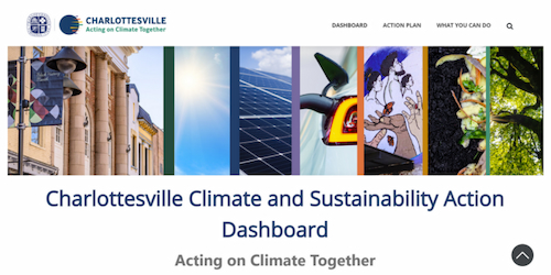
Storytelling Platform
The Dashboard is designed to showcase data points as stories to most effectively engage community members and lead them to action.
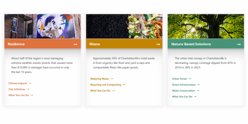
Blog and News Feed
Keep community members informed about your progress, connect the dots on community goals and their actions, and tie it to current events.
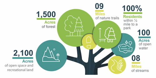
Compelling Graphics
Versatility and Impact
Enhanced Features
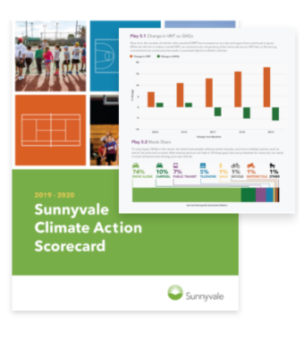
Annual Report
Like a “print button” to easily produce reports on key content, graphs, images, and data visualizations that are already on your dashboard site.
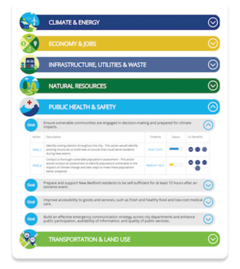
Action Plan Implementation Table
Showcase plan elements, goals, actions, and timeline to demonstrate progress. Mobile-friendly accordion style.
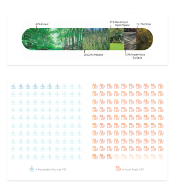
Data Visualization
Go beyond graphs with fun and creative data visualizations like the multi-image graph or a pictograph.
Additional Features
Calculators
Multi-question calculators to help community members determine costs for things like solar panels and electric vehicles.
Infographics
Turn more complicated, nuanced or multi-layered information into user-friendly visuals.
Quick Polls
Get direct feedback and engagement from people with quick, interactive poll questions.
Resource Center
Make it easy for people to find local resources and take action.
Story Maps
Share sustainability achievements or local resources (like EV charging stations) with maps and images.
Interactive chart allows users to click on and off different projects or sectors to see how emissions are affected if those are not implemented.
Think you might be interested in an online Community Dashboard?
Have a few questions about the cost, features or process?
Just want to ask a few simple questions before you sign up for a demo session?
Fire away!
Engaging. Customizable. Affordable.
Starting at less than $10,000 a year
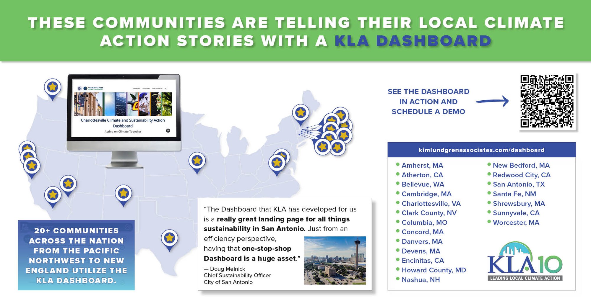
Communities like San Antonio, TX, Nashua, NH, and Encinitas, CA, use the KLA Community Dashboard platform for their climate and sustainability work.
Our clients enjoy:
- Visuals that bring data to life
- Unique storytelling structure for true engagement
- Communications and social media support
- Self- or full-service options
Trusted by local governments:
On more than one occasion, we have been able to quickly respond to requests from City Councilors or staff from other departments regarding our progress toward goals by simply accessing our sustainability dashboard site. It’s especially helpful as the dashboard takes complicated data sets, stored in files that cannot be remotely accessed, and synthesizes them into an easy to understand story supported by data visualization.
This makes it easy for us to quickly find answers and share the site with others, ensuring everyone has access to the most up-to-date information anytime they need it.
It helps to facilitate conversations related to the Town’s sustainability initiatives, including carbon emission reduction, water conservation, and building electrification. By visualizing our focus areas and goals, the dashboard fosters meaningful conversations about environmental action, helping our community stay informed and engaged in local efforts.
Whether exploring data or collaborating on solutions, this tool empowers stakeholders to contribute to a greener, more resilient Atherton.

