
Don't Let Design of Your Plan
Be an Afterthought
You’ve dedicated significant time and energy to your climate or sustainability plan, and you want it to show. Long after the months of community outreach, stakeholder meetings, technical analysis, internal wrangling and final launch, this the final stamp you’ve left – how it will be remembered.
You want a professional product that reflects the process that it took to get there. A plan that tells the story of your climate and sustainability journey and goals in a visual way that spurs action.
Which is why the design of your final plan actually needs to start on day one and be integrated throughout. When we say “design” we mean both the creative piece (icons, images, etc) and the content organization.
At KLA we work with several design consultants to deliver our clients’ plans and other design needs, and we chatted recently with one of them – Terri Courtemarche of Scouter Design – to pull together 15 best practice tips and examples for plan design.
Start with a Brand and an Outline
 1. We recommend that our clients start with a branding process. If you’re on the fence about whether to create a brand for your plan, read our posts from earlier this year: “Yes, Your Climate Action Plan Needs a Brand”. If you’ve already made the [right] decision to create a brand, check out our “Branding Basics: Do’s, Don’ts and Pro Tips”.
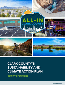
It's the best way to ensure a polished, professional and brand-consistent report like All-In Clark County.
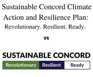
2. Do branding lite at a minimum. If for budget or other reasons, you aren’t able to do a branding process or don’t want a new logo, you will still need to agree on standard font treatment for the plan name. You might be using “City Climate Action Plan” but don’t leave it in plain 12 point black font. That won't grab the reader's attention or give you a common design element to apply throughout the plan or in additional materials. See the Concord example below.
3. Create a basic style guide. Regardless of the process you use, your final plan design will be stronger if you have a plan name and tagline, logo or font treatment, style guide with typography and color palette along with a basic and shared understanding of the community’s personality. Make sure you have your local government’s brand guide or equivalent to ensure consistency. The final plan should then carry over into any post-plan products like a website.
4. You will also need an outline to map out sections or chapters. With multiple contributors and reviewers, this will help determine what content goes where and ensure consistency in length and content. Check out this sample plan outline.
Think About Uses Cases…and the Skimmers
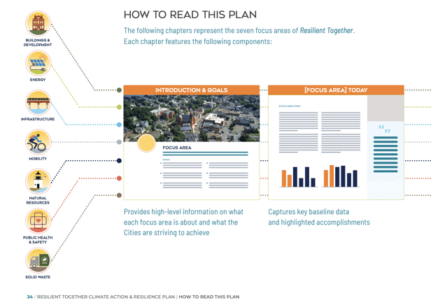
5. Give people some basic instructions. These plans can be a little long and overwhelming, so start with a “how to read this plan” type section to orient people to what’s in the pages to follow.
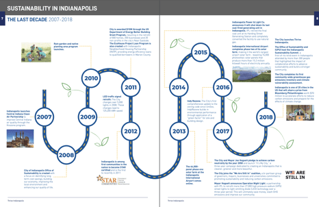
6. Design based on the spread. Any good designer will know not to carry certain elements across the fold while creatively using the divide in other ways (like the Thrive Indianapolis timeline shown here), but it’s worth reminding them.
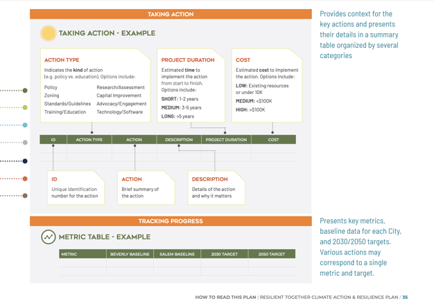
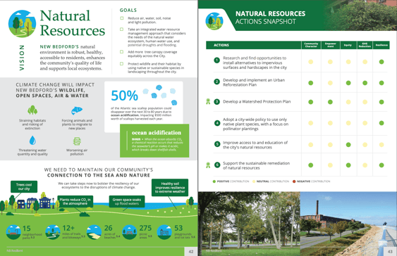
7. Think about pull outs. Is there a particular section of your plan that you’re likely to print out separately? A page that you might want to repurpose for a presentation poster or a fact sheet? This could be a map, infographic, specific topic or set of action items. Make sure you call this out to the designer in advance.
This is an example of the Natural Resources section from New Bedford Resilient which would work well as a one-pager.
8. Design for the skimmer. Let’s face it: you might have created a masterpiece with this plan, but that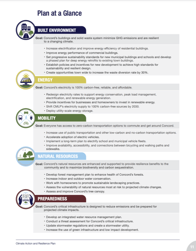 doesn’t mean most people will read it word-for-word. A good chunk of your audience (even decision makers) will just skim it. Share with the designer a few key parts of the report that you would want everyone to see or know about. They can use design tricks – placement, visual cues – to draw and keep the eye there. Concord's "Plan at a Glance" gives people a quick synopsis of the plan's key pieces.
9. Know what level of accessibility – 508 Compliance or otherwise – you need to design for.
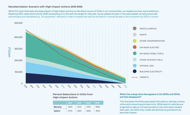
10. Let the designer know the intent or main points of charts and graphs. Those are often the wonkiest parts of a report that, on their own, can be hard to understand or put into context. But a good designer can turn them into interesting graphics or infographics that draw attention and help readers understand and retain the key points. You might have heard this called “data visualization,” a hot term right now for good reason.
One of the most effective applications we’ve found for this is connecting a greenhouse gas (GHG) emissions forecast to the actions outlined in the plan. When done effectively, people can wrap theirs heads around the impact these actions will have. Here is one example from the Beverly-Salem Resilient Together plan.
Be Thoughtful as You Collect and Curate Images
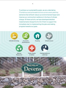
11. Be authentic by incorporating as many local photos from your community, real people and the planning process as possible. That means you can’t wait until the last minute to find photos! Reach out to other departments (including tourism and economic development) to see what assets they have, and consider hiring a local student or upcoming photographer to capture local images you need. These days, you can grab photos with your smartphone that work -- and basic photos of local landmarks or street signs (Devens example shown) add a nice local touch.
12. Stock images can work for generic needs (i.e. fruits and vegetables to show healthy food) or aspirational pieces of the plan (i.e. electric school buses that are a key plan action).
13. If you do use stock, read the license carefully. Some have restrictions on use. Do not pull images from websites due to copyright concerns. Make sure you provide photographer credits where needed.
Process Points to Remember
14. Review and revise early. Ask to see 2-3 concepts of the cover and 1-2 interior pages before the designer dives too deep to ensure it’s heading in the right direction. Plan a quick call to actually talk through feedback so nothing is lost in "track changes" translation.
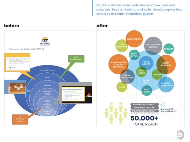
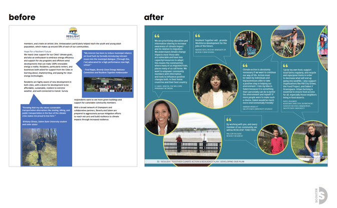
Here are some "before and after" examples to show how you can work with a designer to take your information and basic vision and turn it into a solid final product.
15. Add in sufficient review time with extra padding at the end to ensure proper QAQC.
All that is to say: give credit where credit is due. Good design has the power to make your climate action plan pop and give it staying power. But you can't wait until the end of your planning process to pay attention to it.
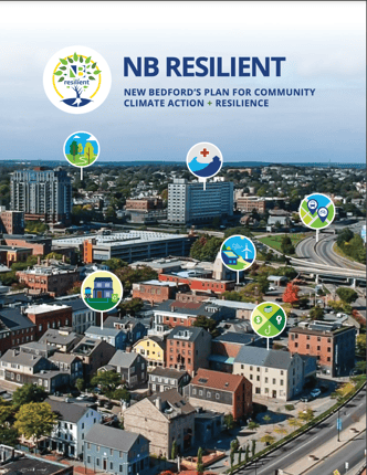
Bonus best practice: What could have been a simple cover for the New Bedford Resilient plan was taken up a notch by simply adding icons from the plan. That lends color and meaning to the cover and connects the reader to content and graphics they will find throughout the plan.
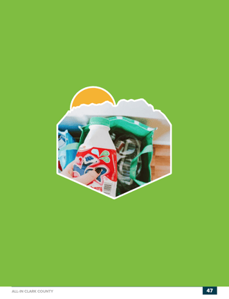
Another bonus best practice: Always think of ways to incorporate the logo and other design elements for brand consistency and flair, like these pages for All-In Clark County (utilizing the logo outline).